About Our Logo

I don’t know if you’ve noticed our logo. It’s sort of a six pointed knot. I’ll tell you the story about it.
Many (many) years ago, I was hired by Jager Di Paola Kemp Design, a design firm in Burlington (I believe they have changed their name/rebranded to “Solidarity of Unbridled Labour“). They’ve done work for Phish, Magic Hat (a VT brewery) and a ton of other local and not-so-local names including (and most importantly for this story) Burton Snowboards who is headquartered in Burlington, VT.
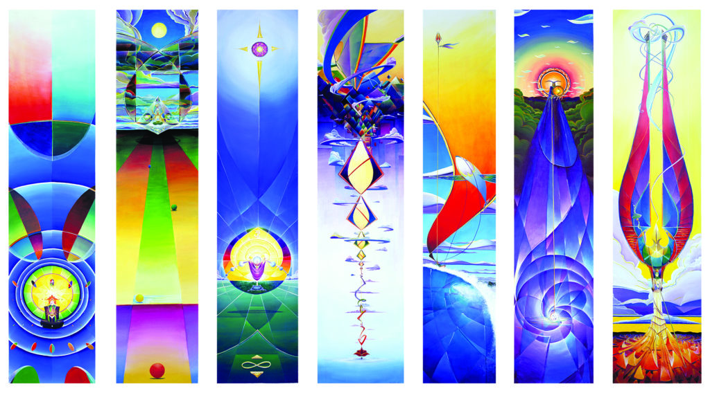
In 1998 I was hired by JDK to create designs for Burton’s Supermodel snowboard. They were looking at Alestair Crowley’s Thoth Deck of tarot cards and they wanted me to ‘reinvent’ the imagery of a selection of cards that they were drawn to. I made the 7 paintings below. They are, from left to right: Alchemy, Balance, The Priestess, The Prince of Swords, The Prince of Wands, The Princess of Discs, and The Queen of Wands. Each of them is around 14″ wide and, while heights vary, they are around 5′ tall.

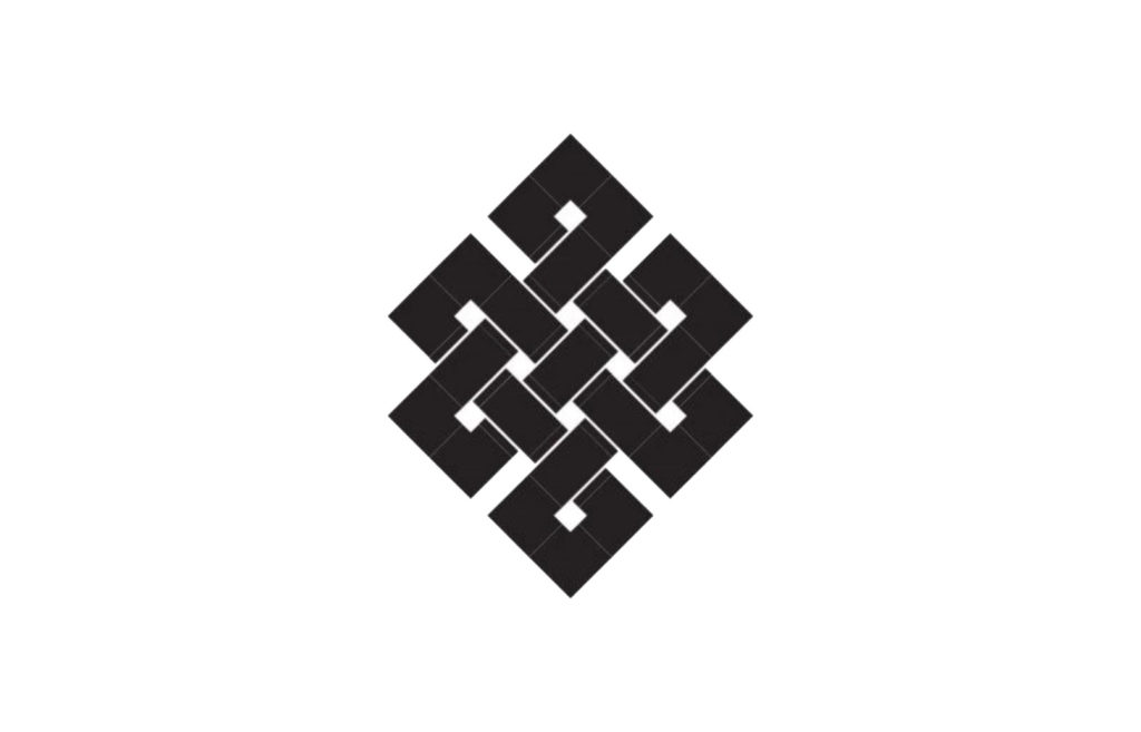
In the midst of the drawing sketching for that project while I explored the symbols and meanings of the cards, I started musing on the Tibetan Buddhist infinity knot, or ‘eternal knot’ as it’s known. In Sanskrit, it is is called དཔལ་བེའུ། and, in Tibetan, palbeu, and it symbolizes the endless wisdom and compassion of the Buddha

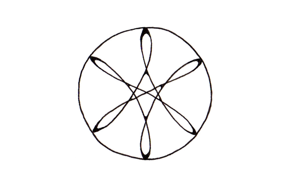
While I am not an adherent to any particular path, Buddhism has long been a part of my world. In the midst of my musings, I drew this:

To me, there was a flowing architecture in it that had a sense of momentum around a center jewel that only exists because of each flowing corner. That drawing floated around my jpegs folders and my drawings and in and out of my musings for many years.
Some years ago, Violet and I decided to rebrand the look and feel of Ten Thousand Visions. When I began it, it was simply my own project – a URL I registered in 2000 because I needed a website. and it was, for many years, an ever evolving online space to see my work. But as time passed, and we’d met and grown together, it became a mutual endeavor. Our projects grew from simply the paintings I made to printing and publishing, installations and murals, and more. The simple stamp icon which had been my personal logo no longer sufficed. We needed something that captured this sense of a journey through all of these different facets of our creative endeavors.

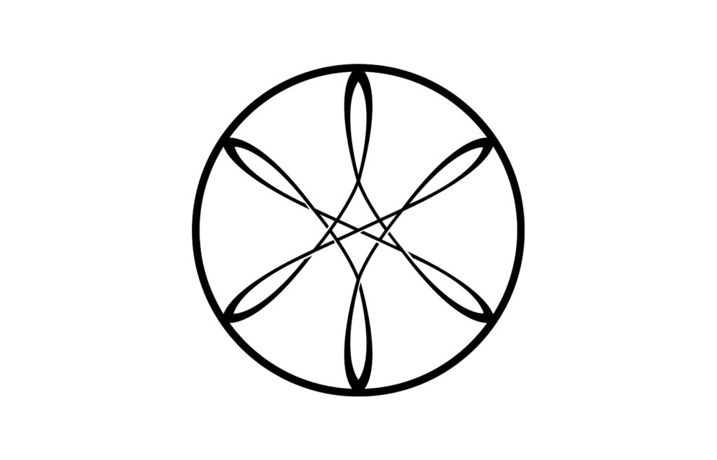
So the new logo was born. I retraced and cleaned up the original drawing in Illustrator, crafting something more ‘knot-like’ with the overlaps of the different segments. And it encompass more of what we are about – which is not just the various projects and endeavors we find ourselves in but also about crafting an elegant flow through this chaotic world.

